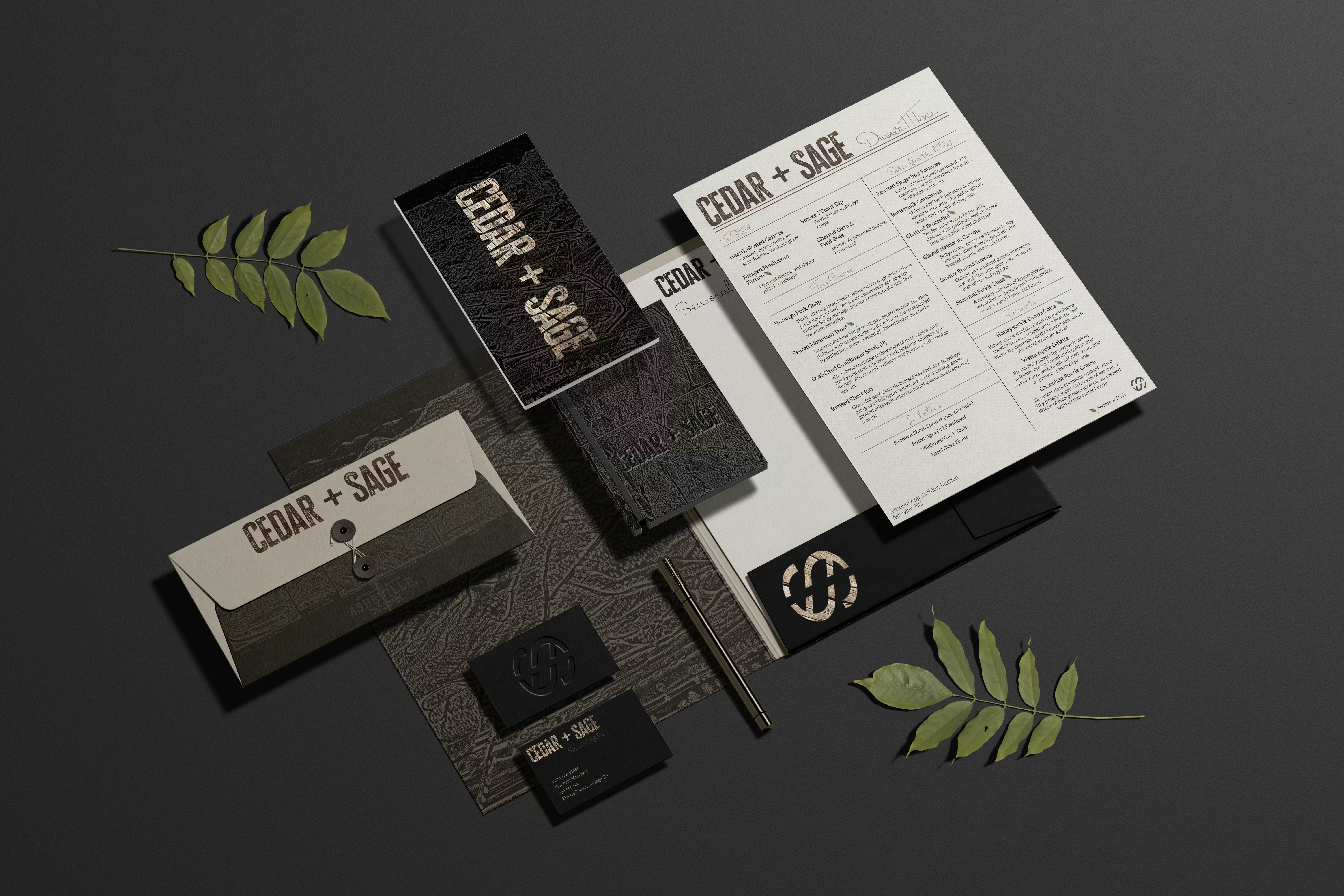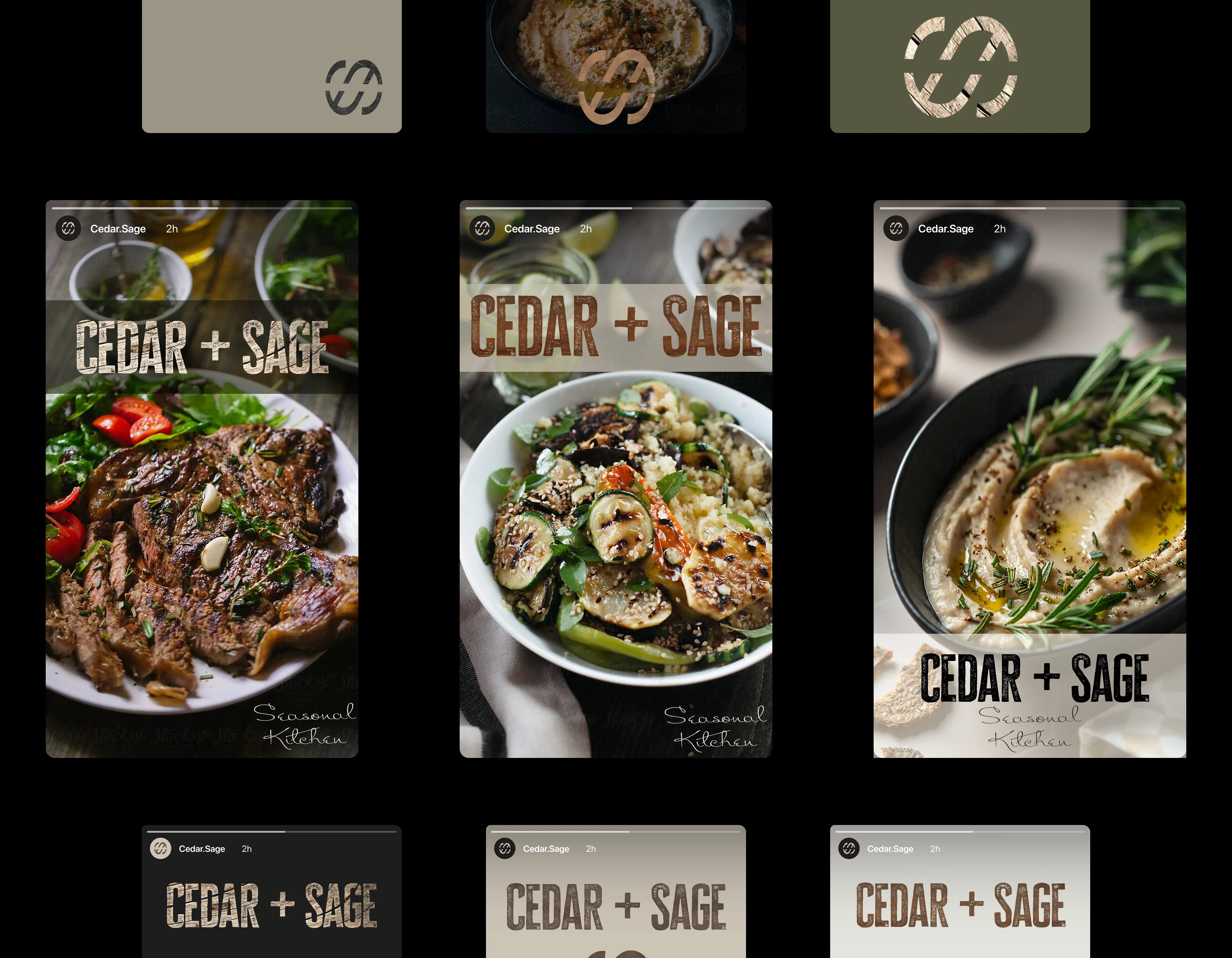

Cedar + Sage celebrates hyper-local ingredients, wild-foraged flavor, and heritage cooking techniques.
Challenge
The goal was to strike a balance between rustic authenticity and refined presentation — capturing the region’s depth and story without veering into clichés. The identity had to feel handcrafted but elevated, heritage-driven but current.
Approach
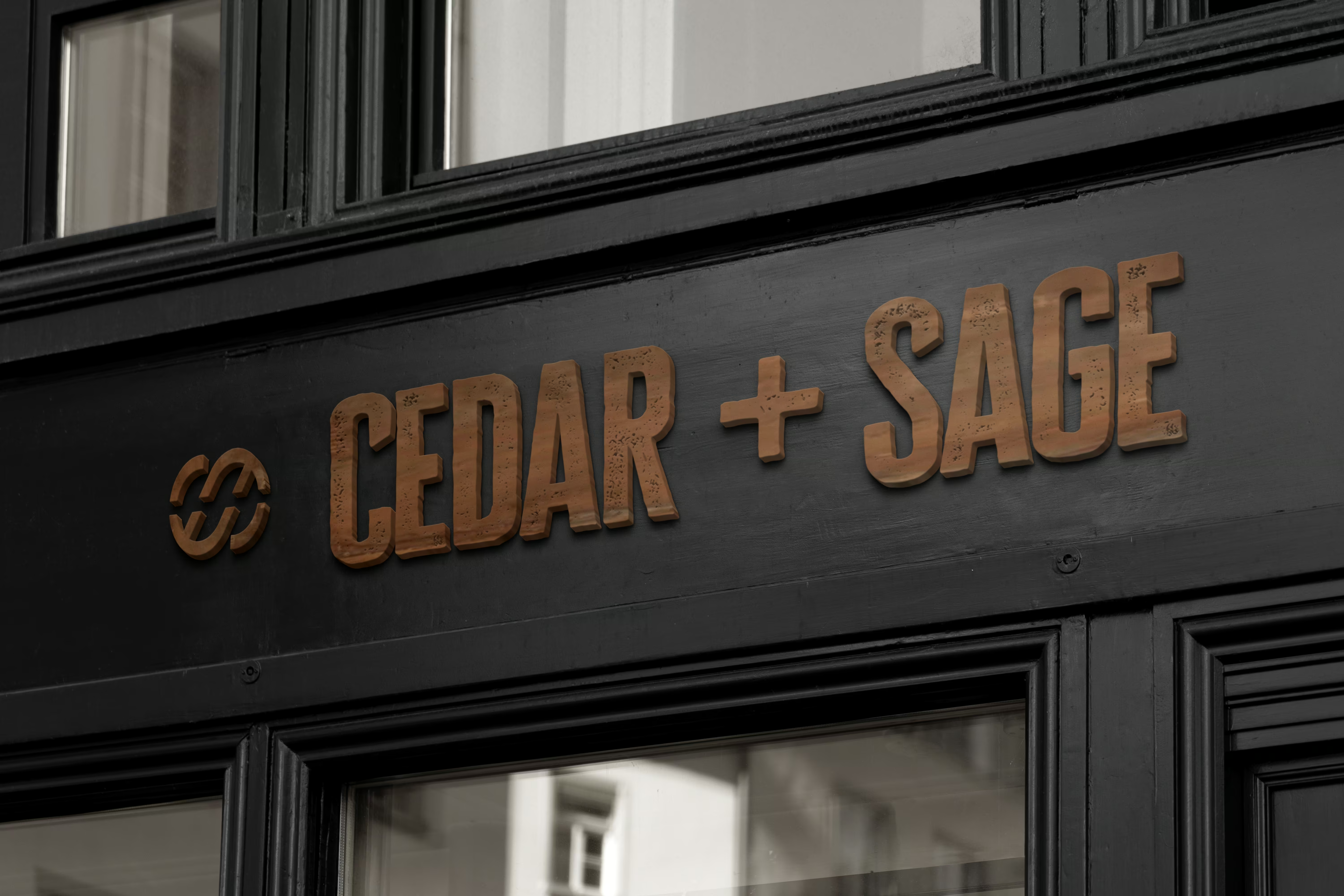
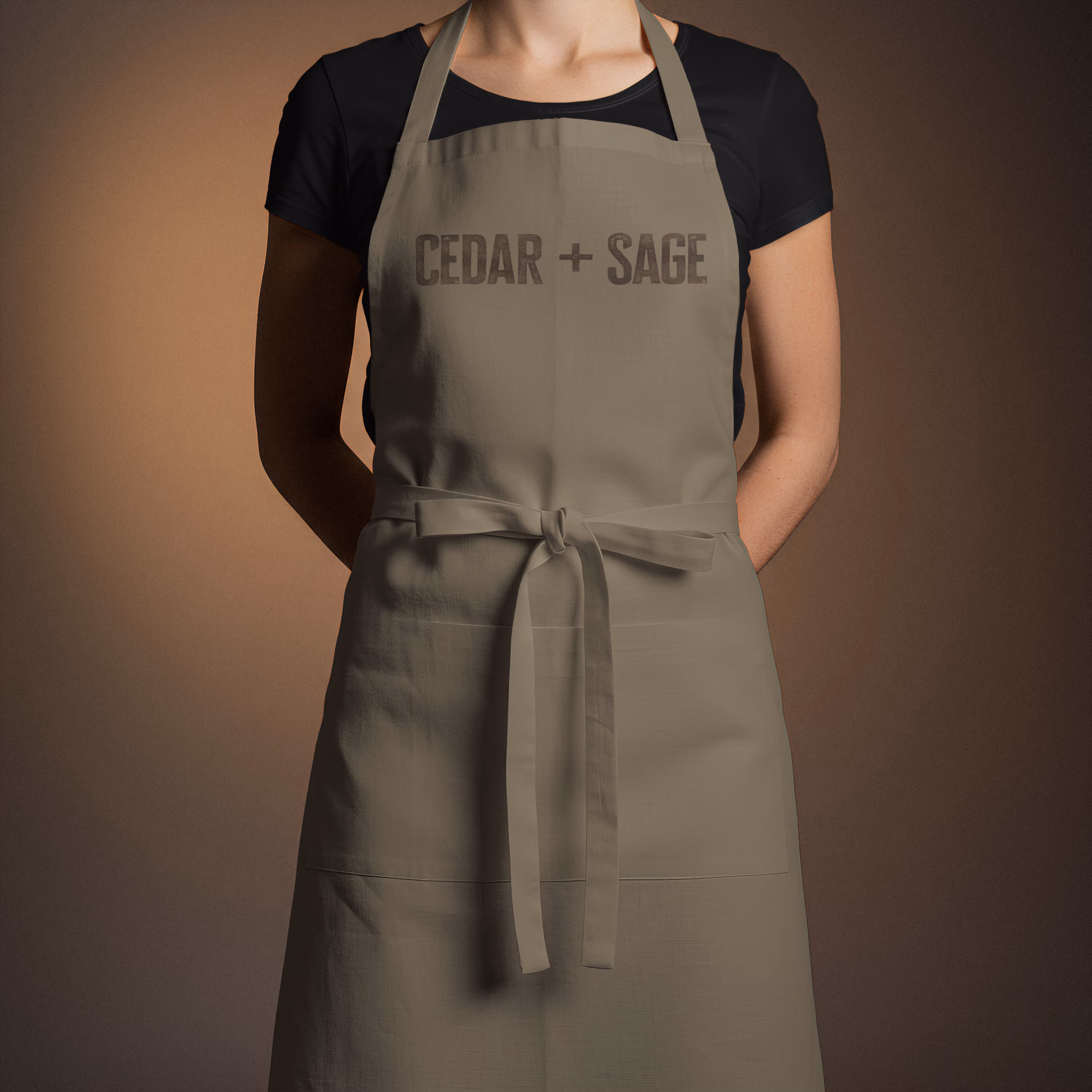
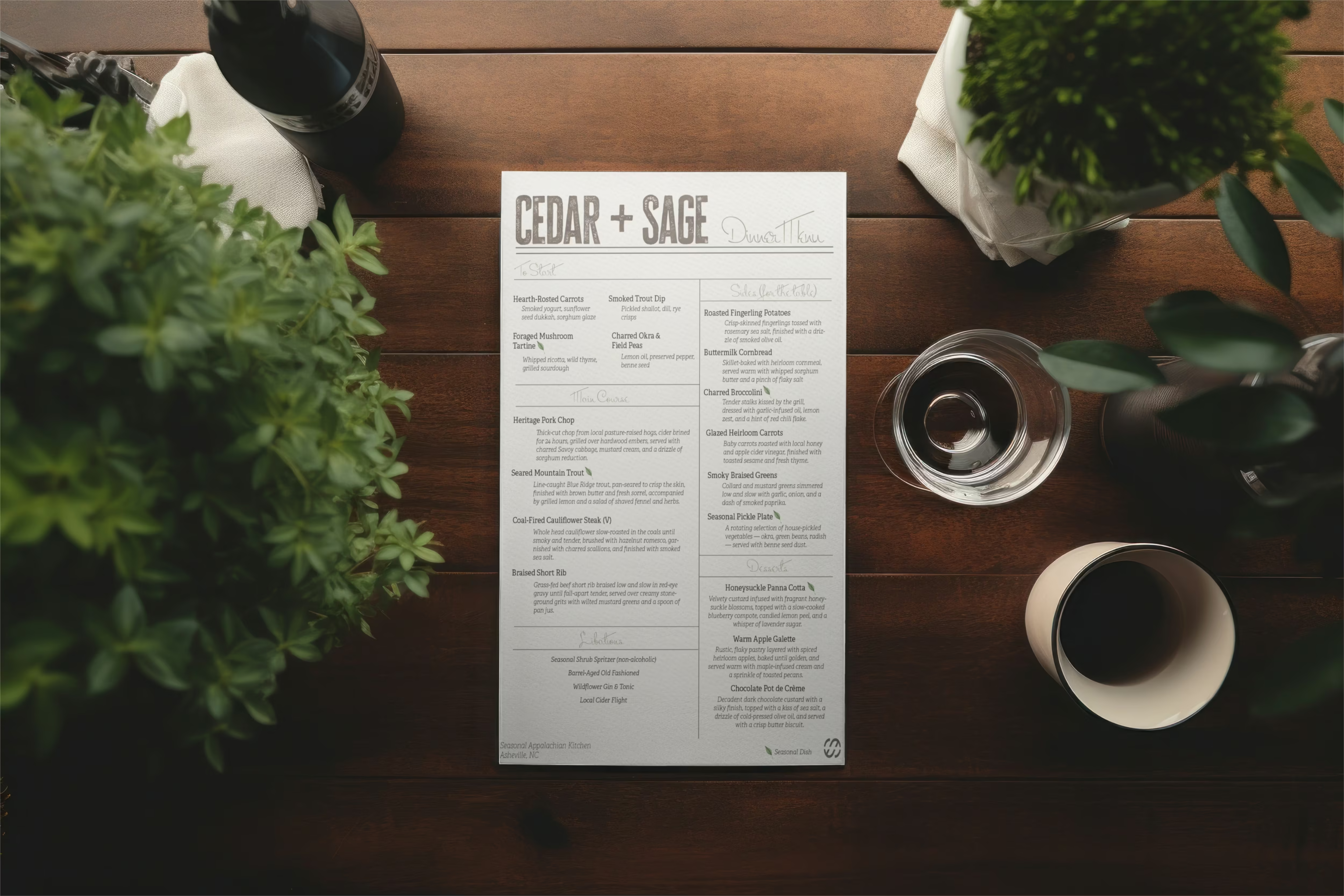
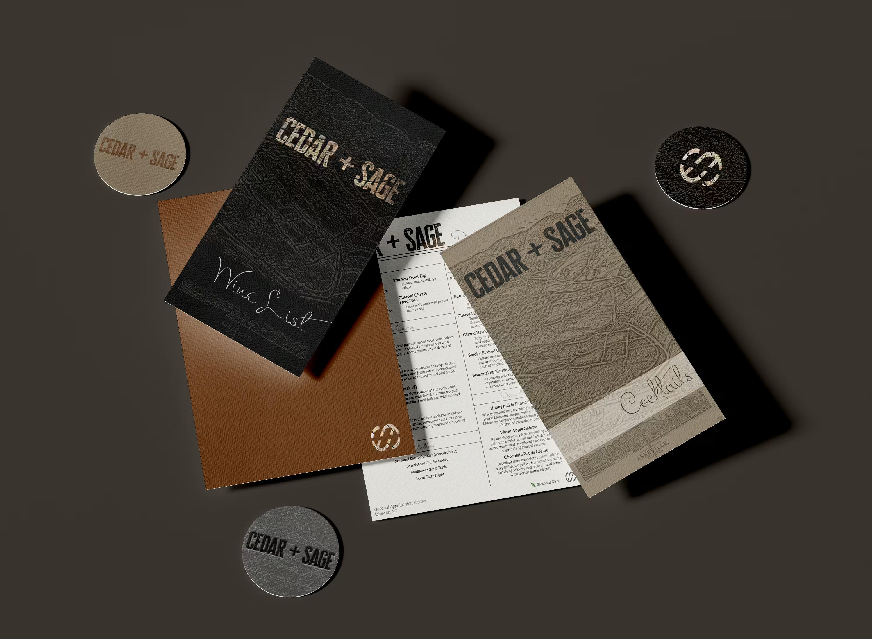
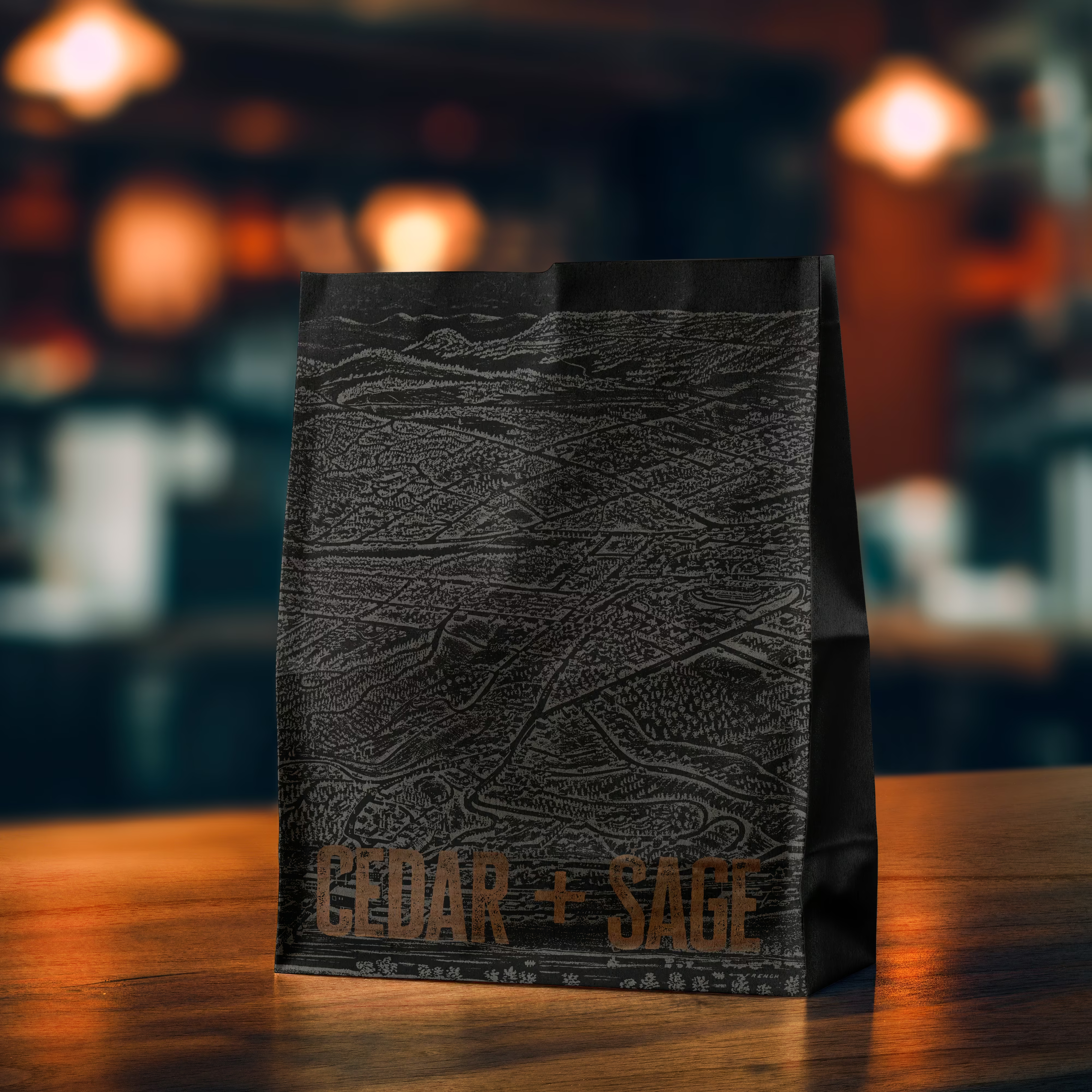
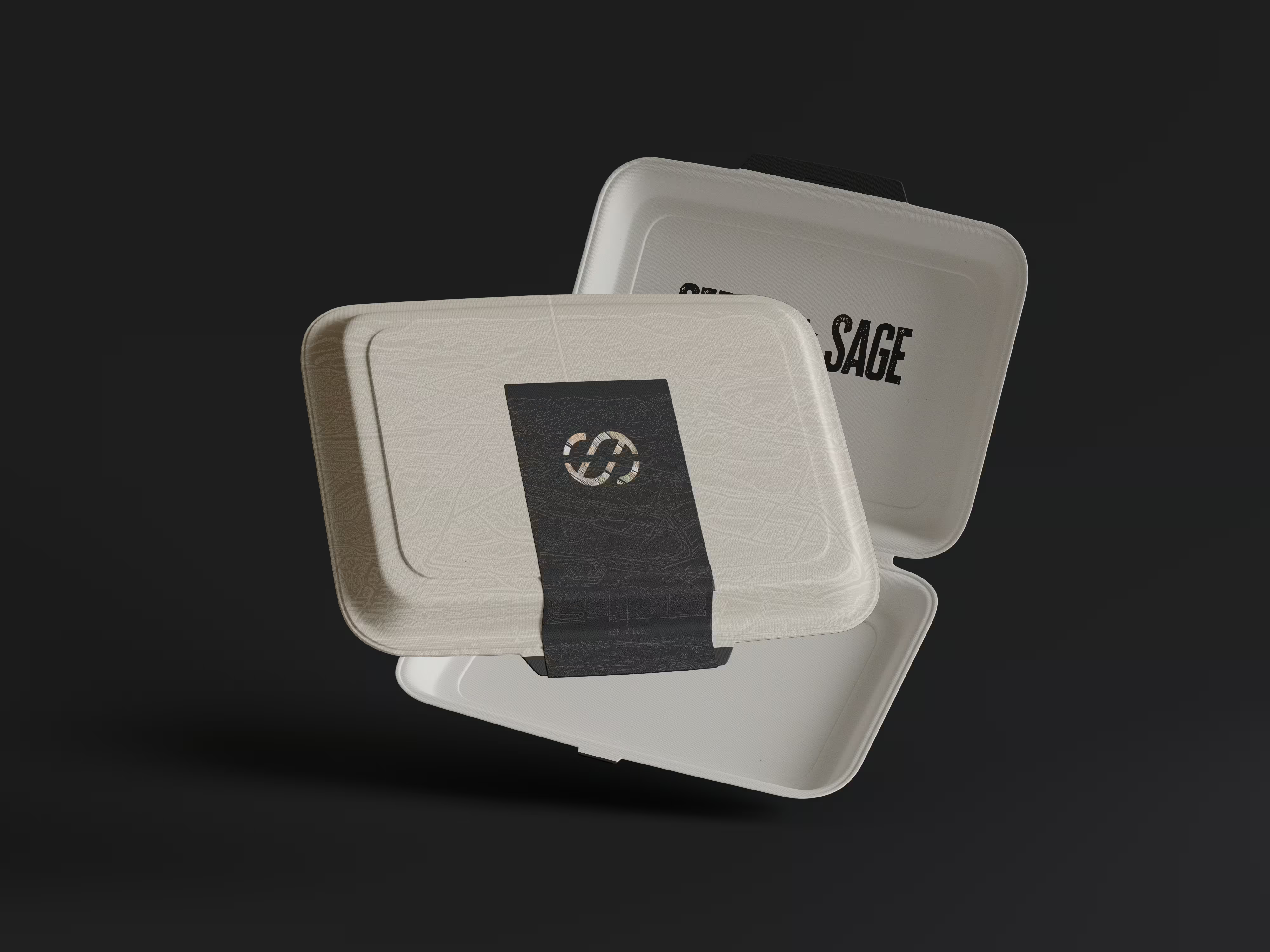
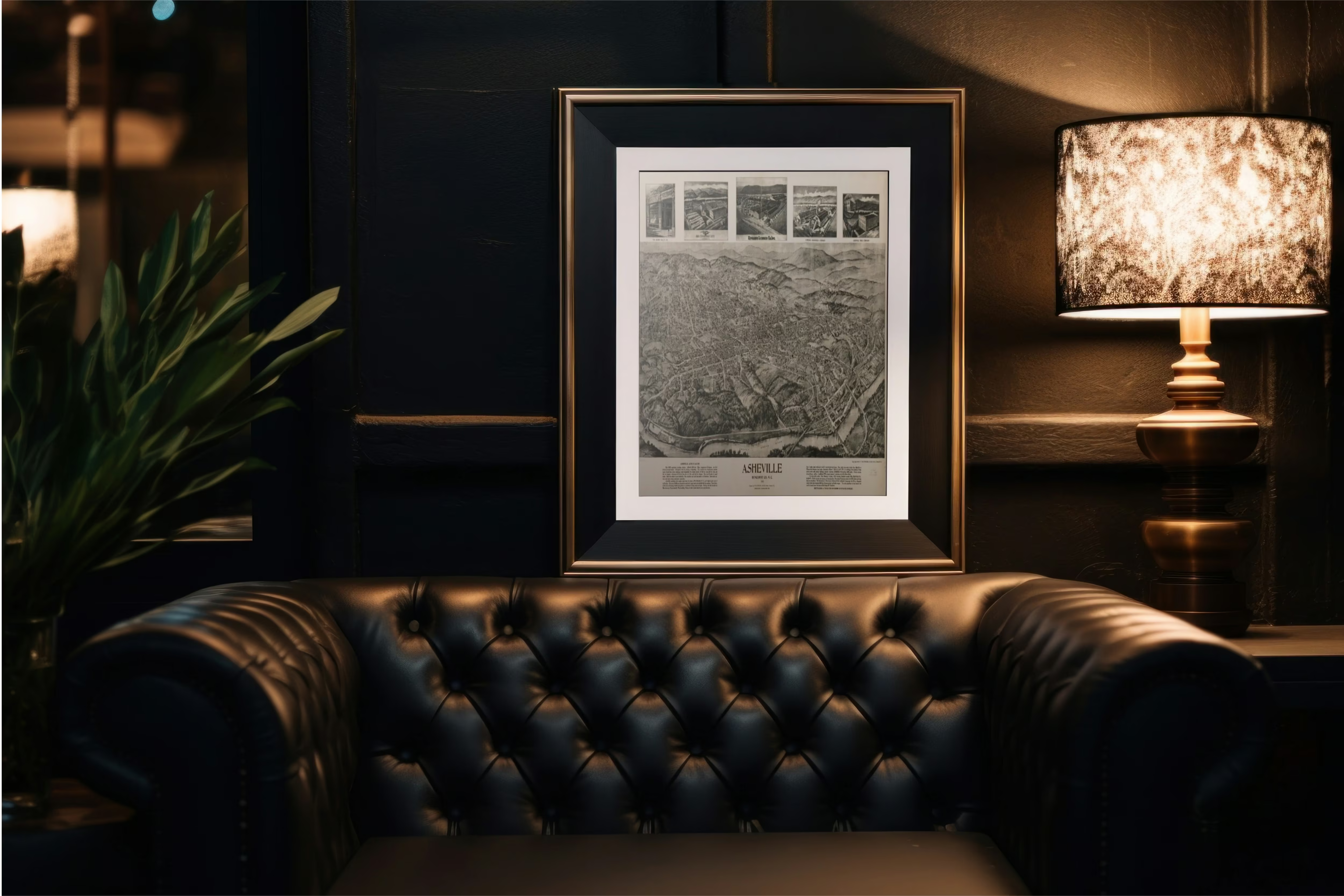
The brand name, Cedar + Sage, was inspired by two plants native to Appalachia — one grounding, one aromatic — reflecting the duality of the space. The identity system leans on a restrained palette, archival topographic illustrations, and tactile materials that evoke place and process. Typography was chosen to blend legibility with character, and print materials were designed to feel heirloom and handmade.
Result
The final identity captures a sense of Appalachian quiet luxury — thoughtful, grounded, and richly storied. It creates space for seasonal change while maintaining brand consistency, and invites guests into a dining experience that feels both intimate and immersive.

Ready to Elevate Your Brand?