
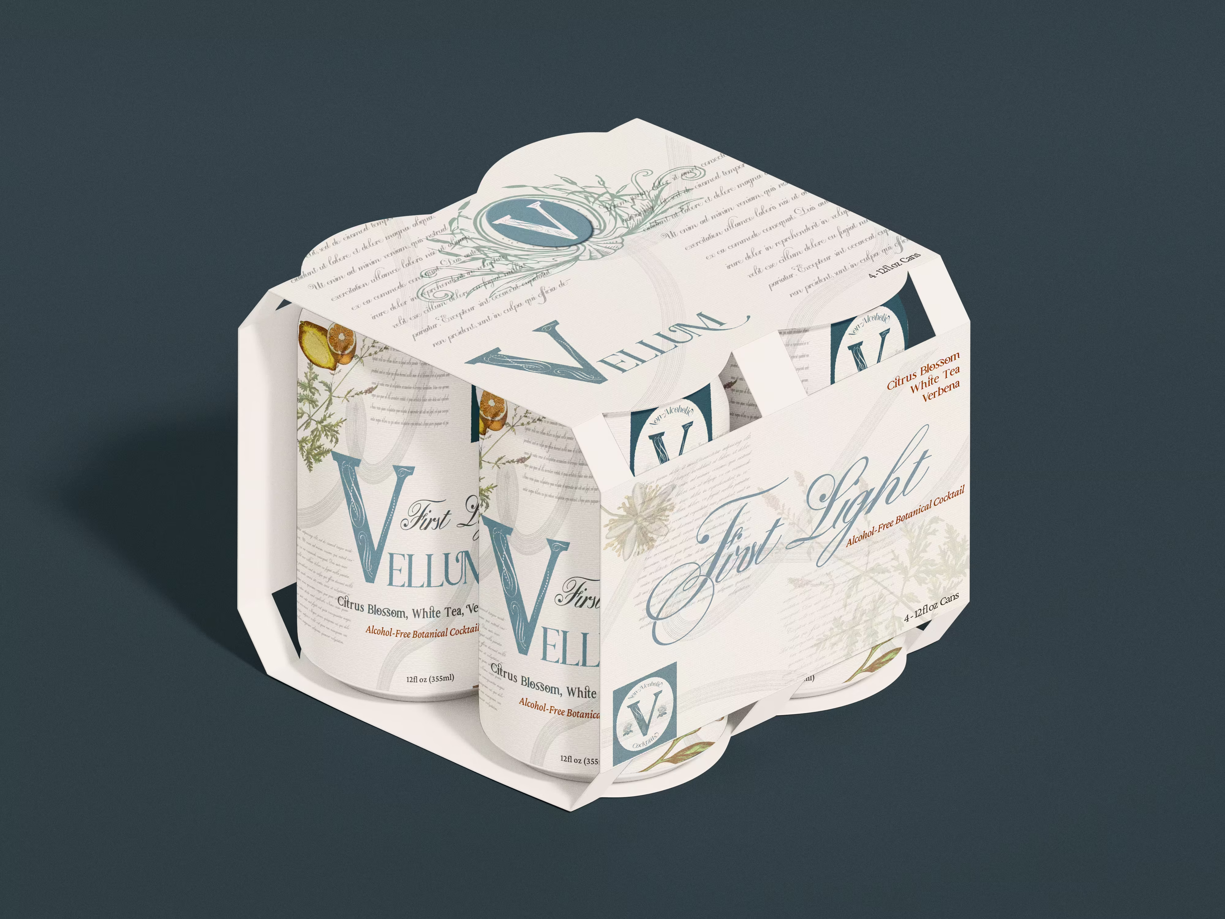
Designed for the sober-curious and design-obsessed, Vellum brings editorial edge to non-alcoholic cocktails.
Challenge
With zero-proof beverages becoming more saturated — and often leaning into wellness or overly precious aesthetics — Vellum needed to carve out space that felt more editorial and edge-driven. The challenge was to design a brand that appealed to a design-savvy audience without alienating a broader sober or moderation-seeking market.
Approach
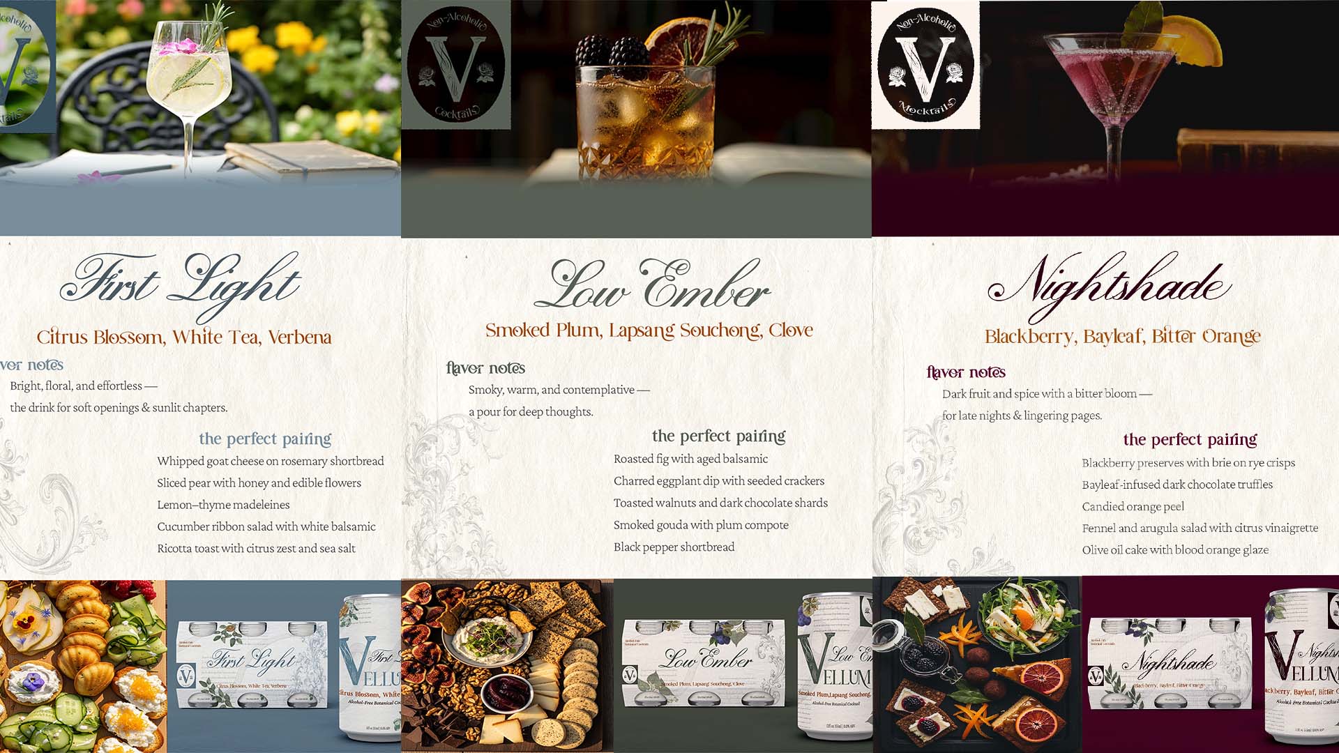
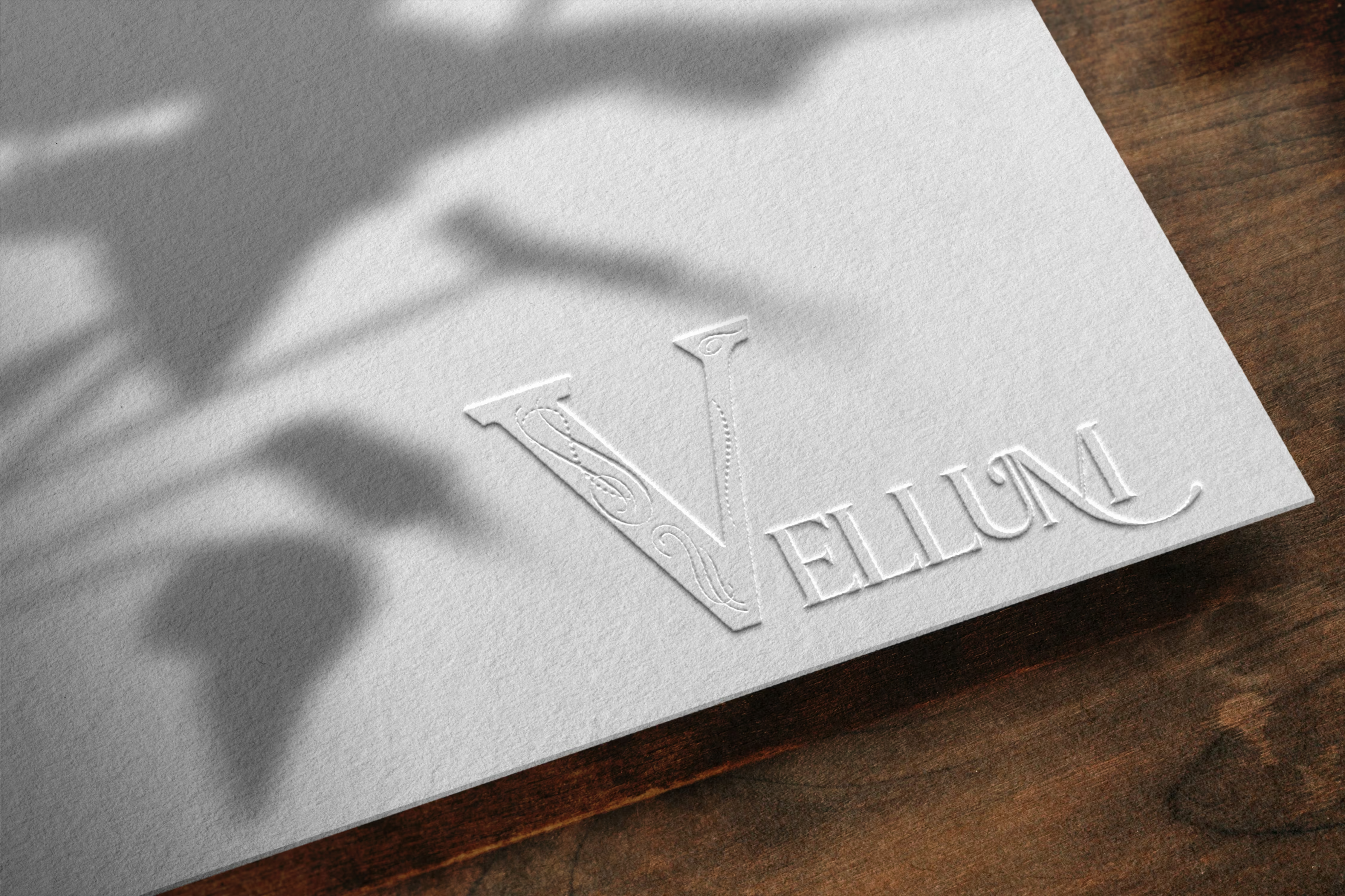
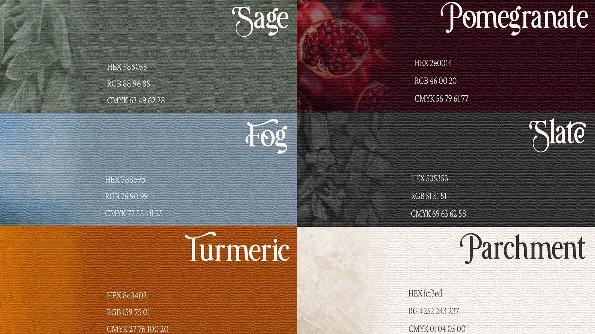
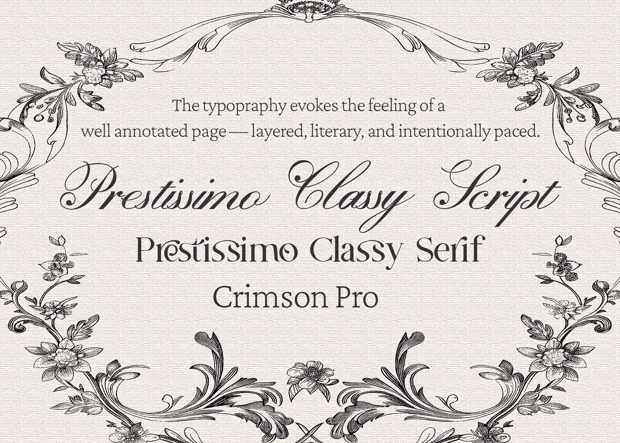
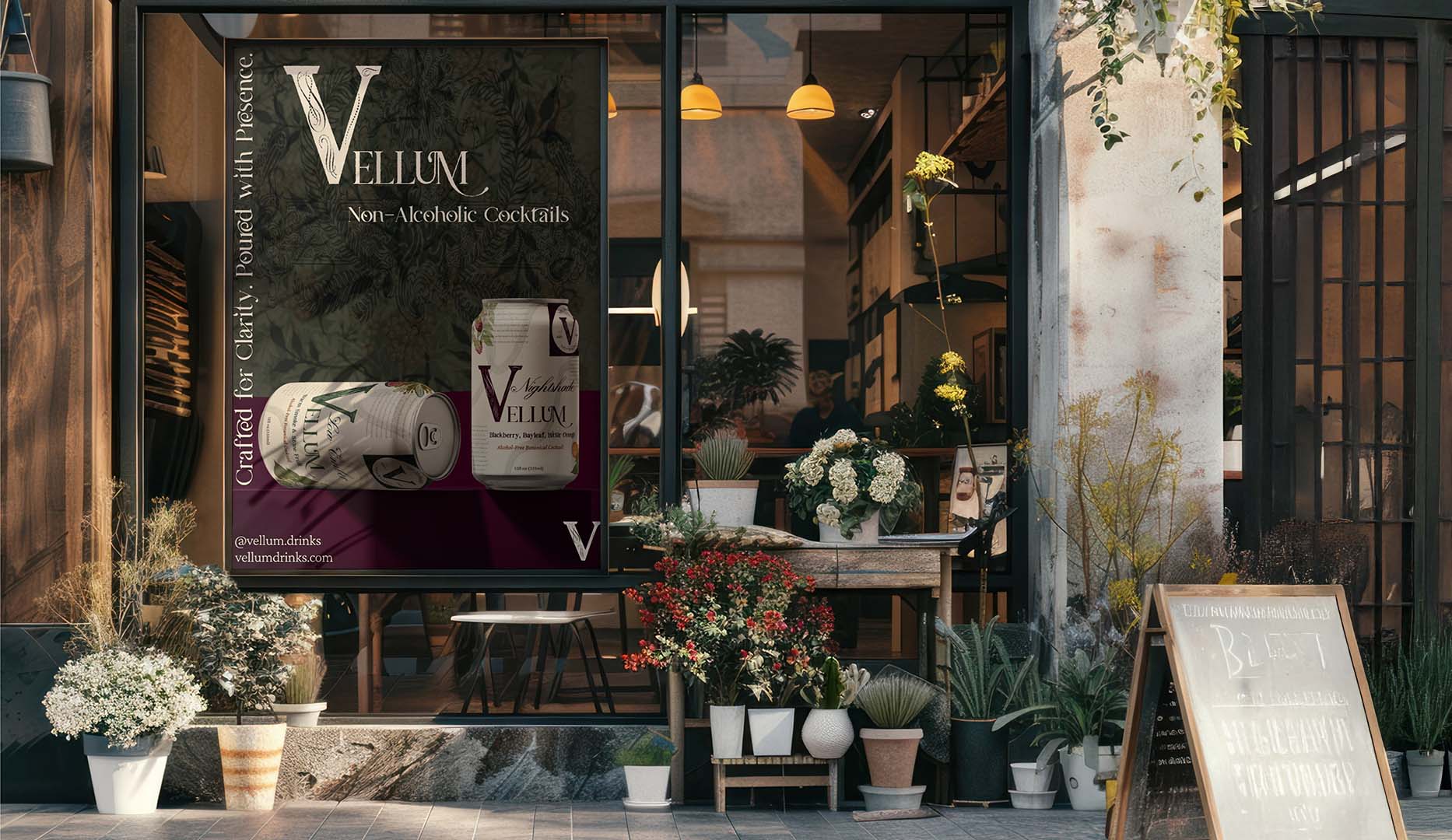
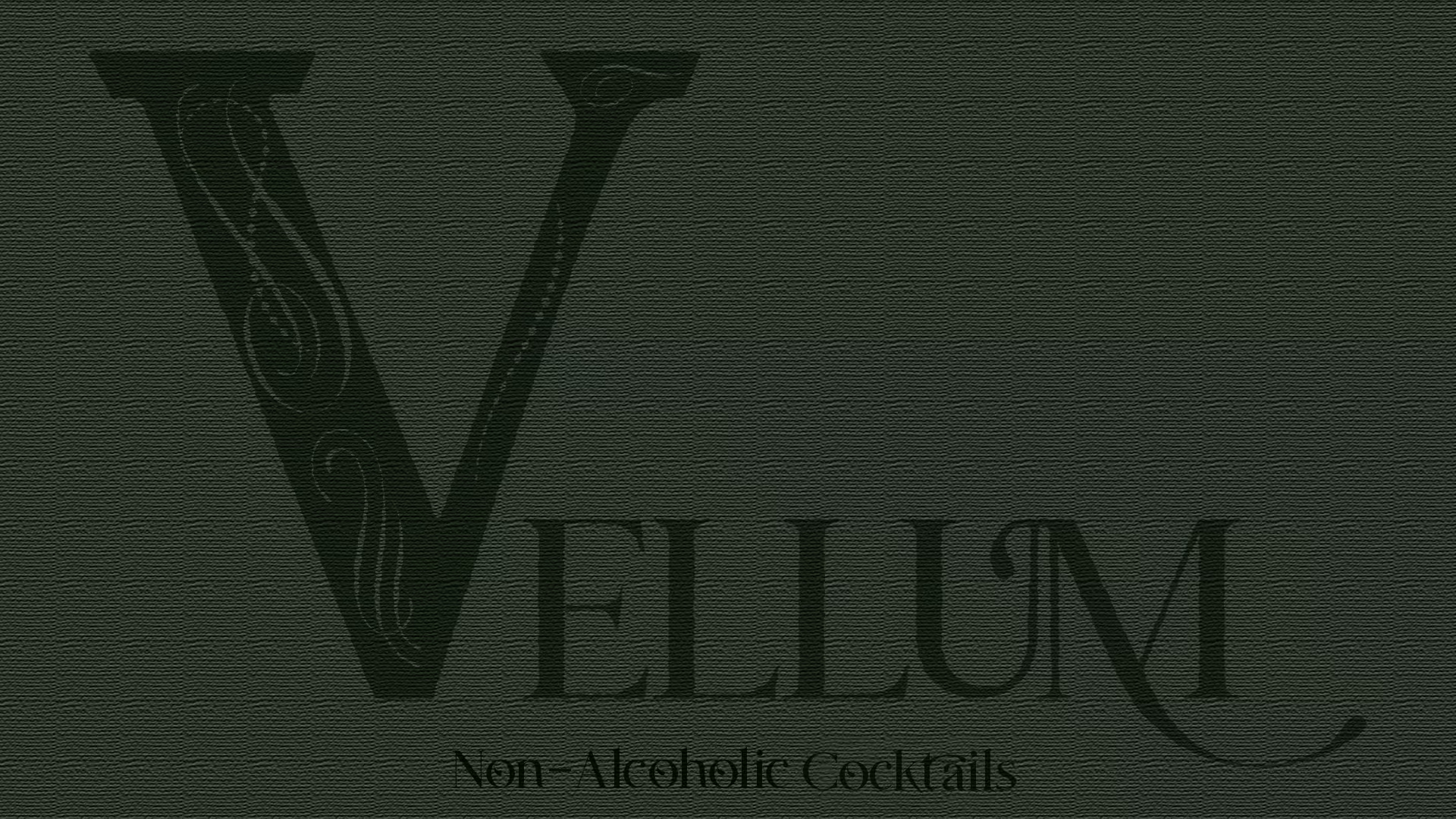
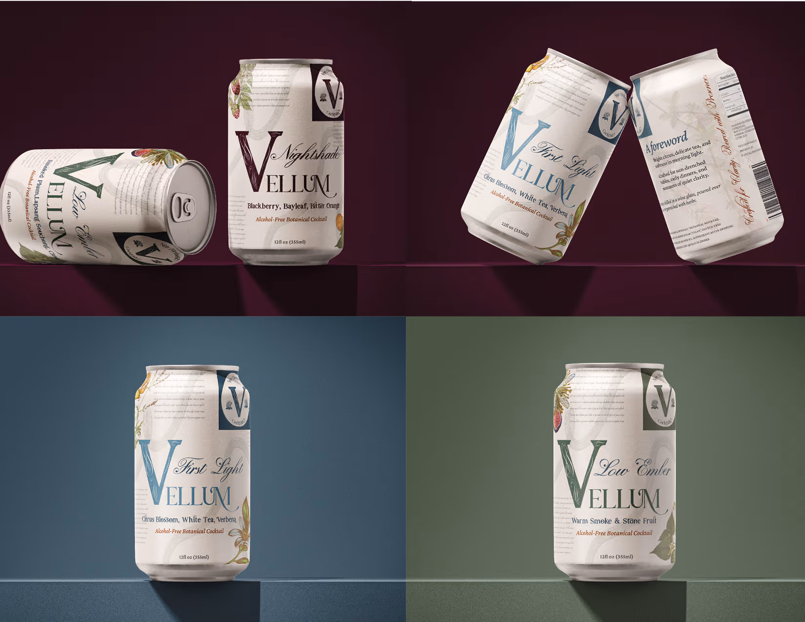
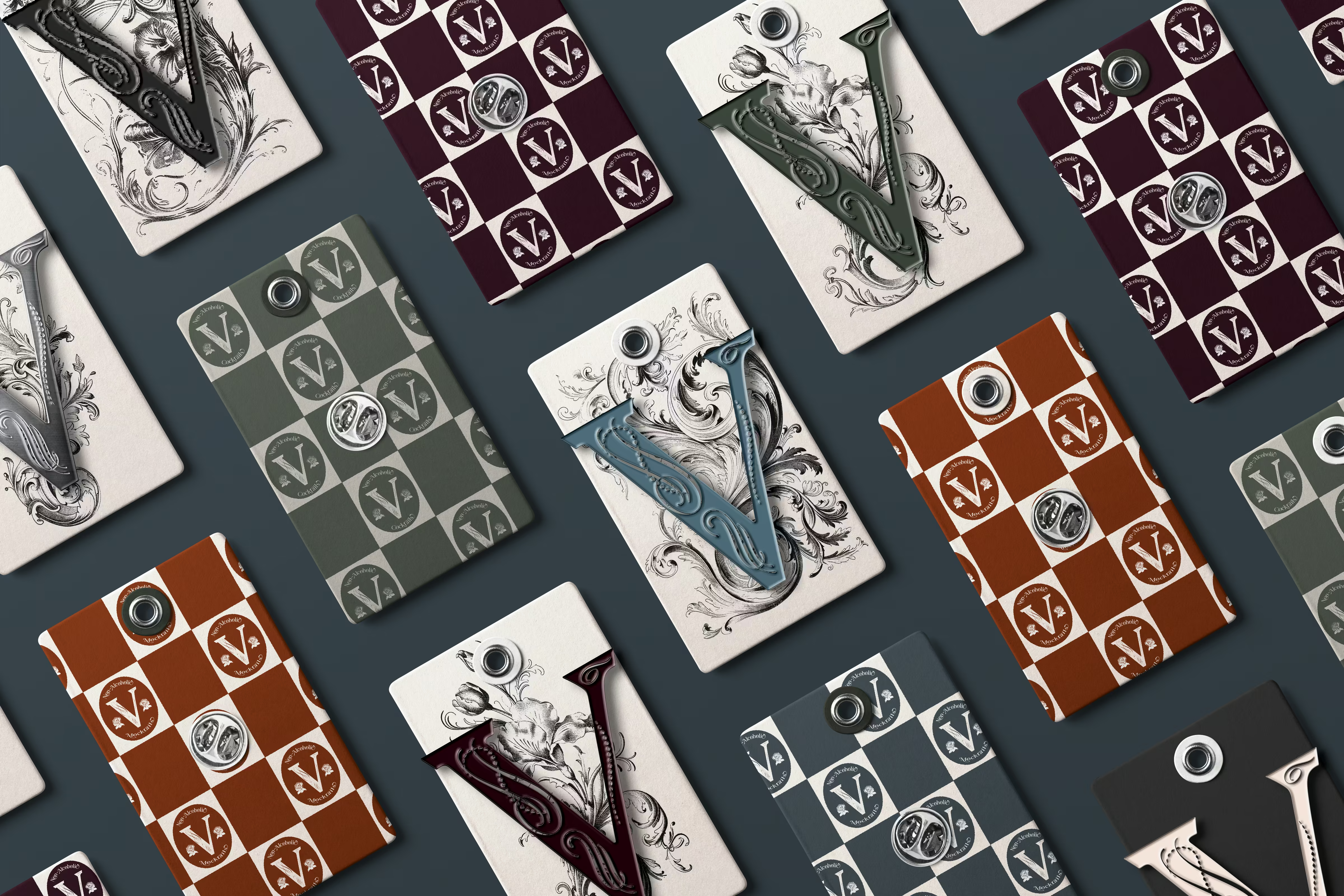
The name “Vellum” evokes texture, storytelling, and craft. The identity was built around rich, tactile contrasts: soft neutrals against inky blacks, serif typography paired with brutalist layouts, and packaging that feels like limited-run print. Photography leaned into mood and ritual — smoke, glass, dim light — capturing the intimacy of the pour.
Result
Vellum launched as a brand that confidently sits between category disruptor and quiet indulgence. It’s drink design as editorial object — collectible, immersive, and unlike anything else in the space. The identity invites slower consumption, aesthetic discovery, and an entirely different kind of celebration.

Ready to Elevate Your Brand?
.avif)
.avif)